
Graphic Design
CASE STUDY
BRANDING • IDENTITY
STYLE GUIDE
Overview
This is a branding kit for Angie Mesenbrink, a local physical trainer in the Portland, Oregon area who is also a mom that could kick my a**.
I was approached by Angie (politely) to come up with something contemporary and bold that would appeal to a younger male and female demographic. The primary use of the brand would be for marketing on social media to grow her client base.
Timeline
2 weeks
Project Scope
The deliverables would include a flexible logo system, messaging (tagline), patterns, and photo graphics to convey the image she was looking for. The extra collateral was created for prototypes or ideas she could use down the road. Style guide developed for usage, as well.
Execution
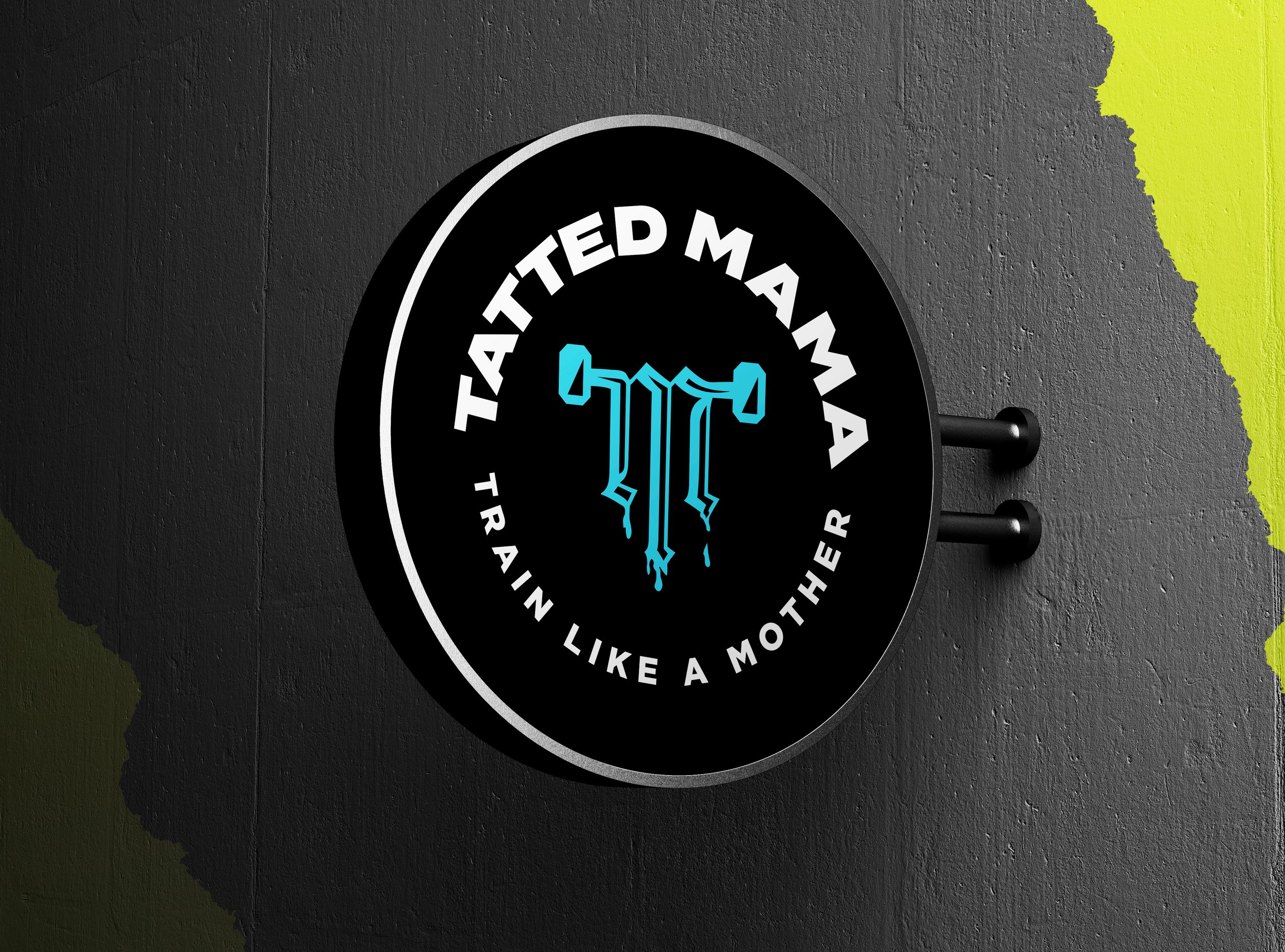
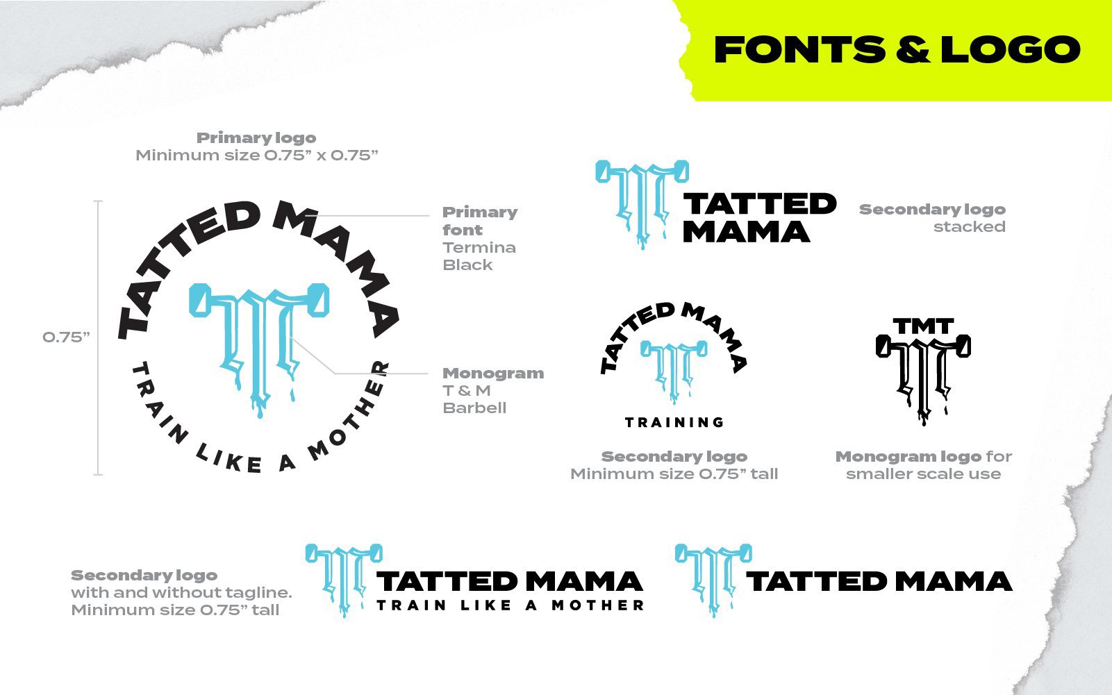
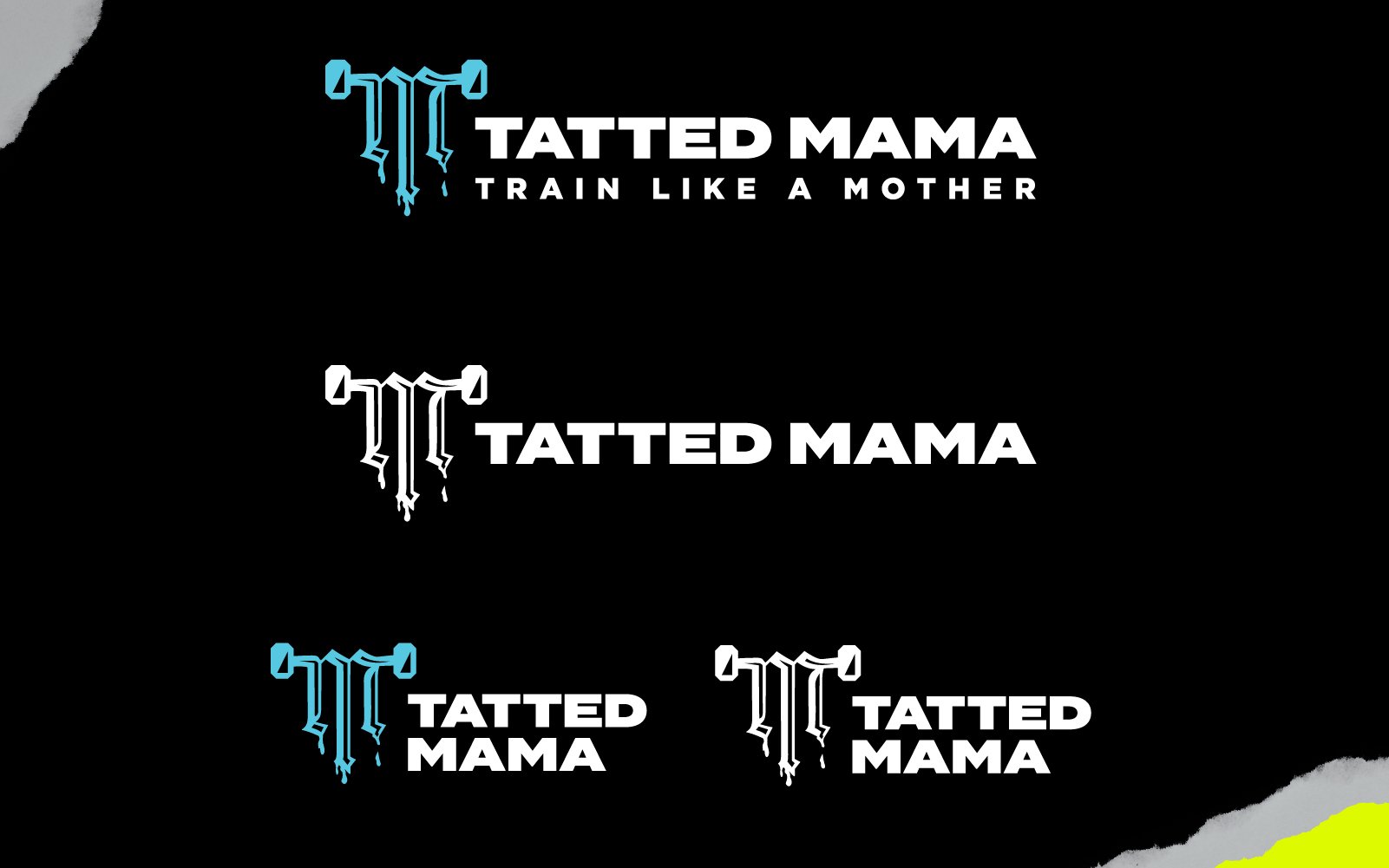
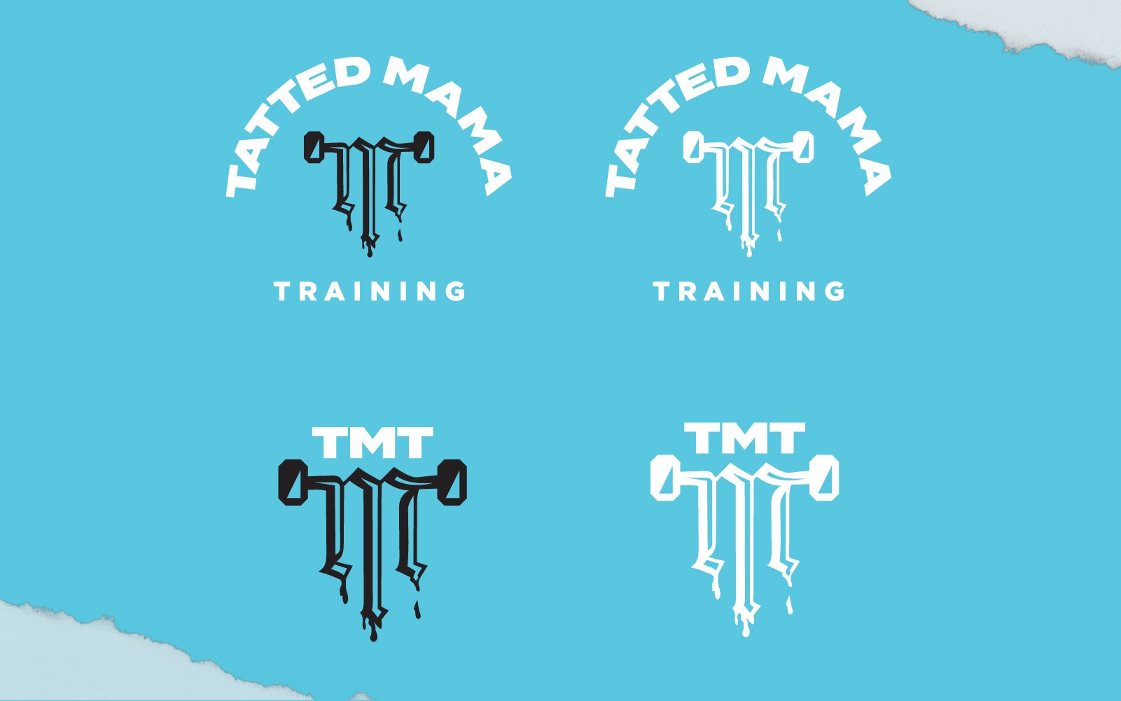
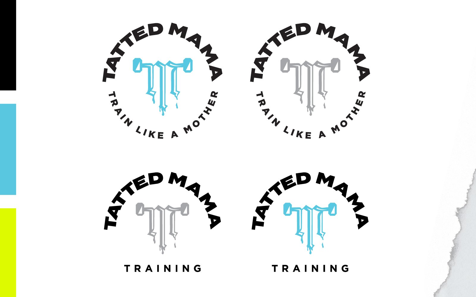
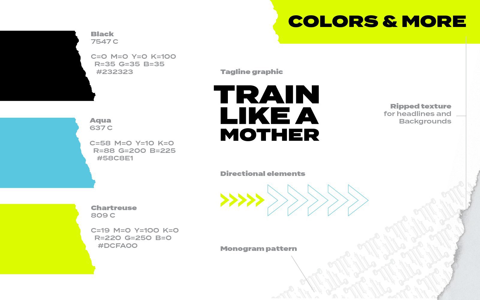
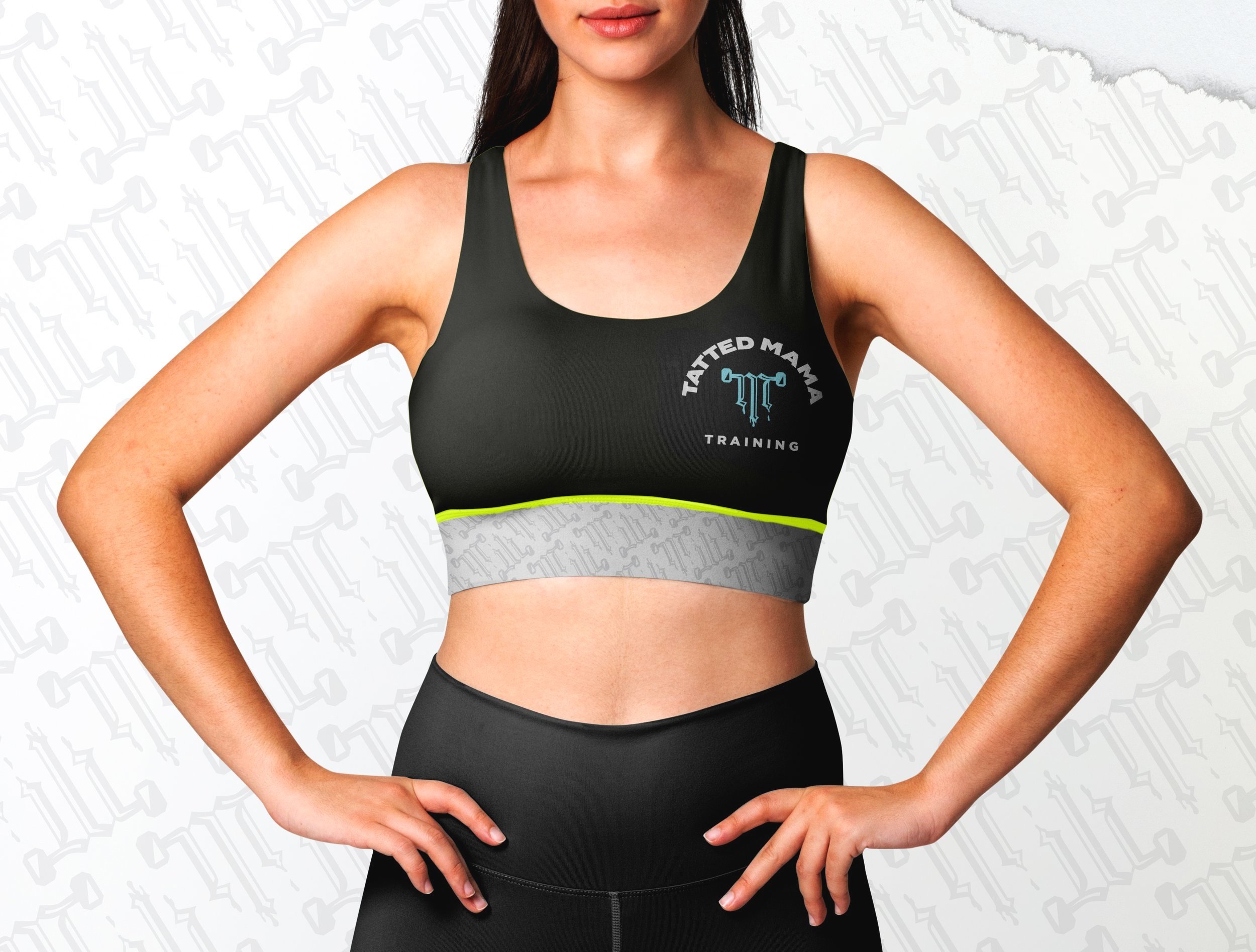
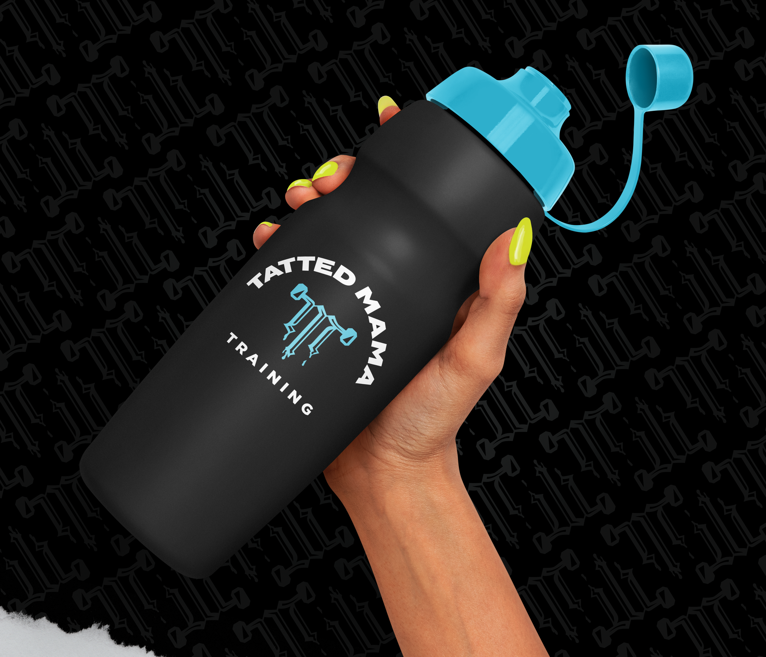
For the logo, she wanted something flexible and bold, that could work in many iterations and sizes. While being in incredible shape as a mom is rare, another one of the unique traits of Angie is her tattooed body—adding the ink aspect into the T+M barbell monogram of the logo made a lot of sense, giving more emphasis to her name. The monogram also provides a simpler identifier, working well in instances where the full logo would be too small to read. The font used is Termina, which conveys a modern and heavy look.
The palette selected comes from a very popular combo of chartreuse and bright blue, to contrast the heavy use of blacks and grays. The chartreuse for spots of contrast or visual queues in layout.
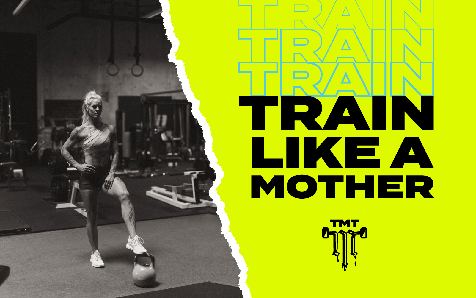
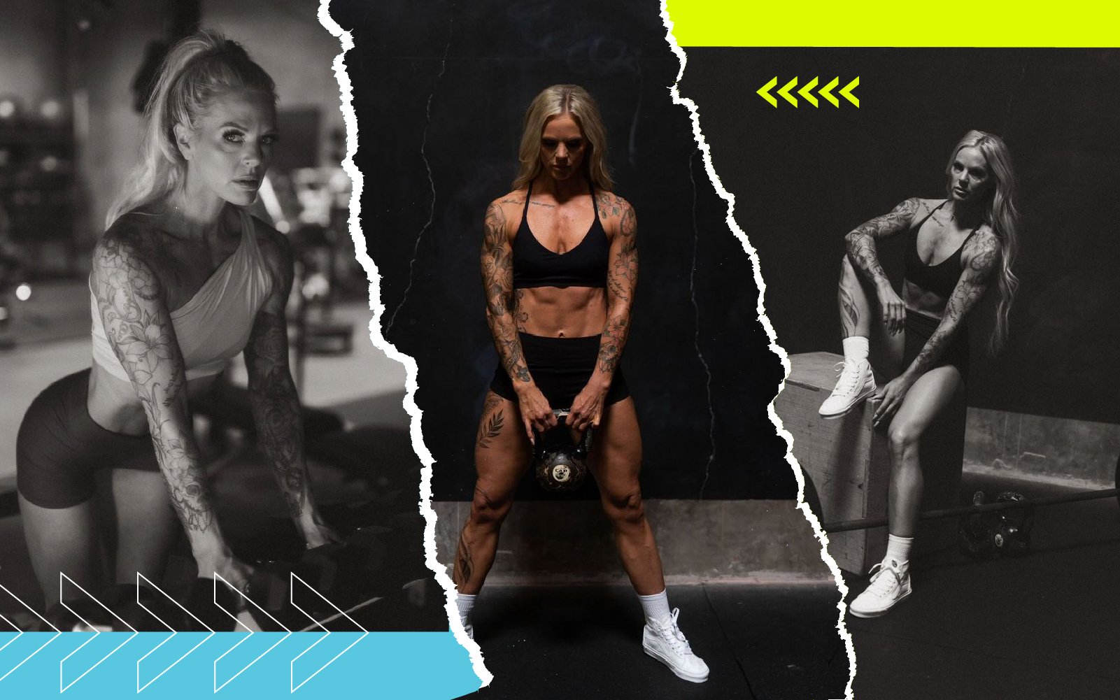
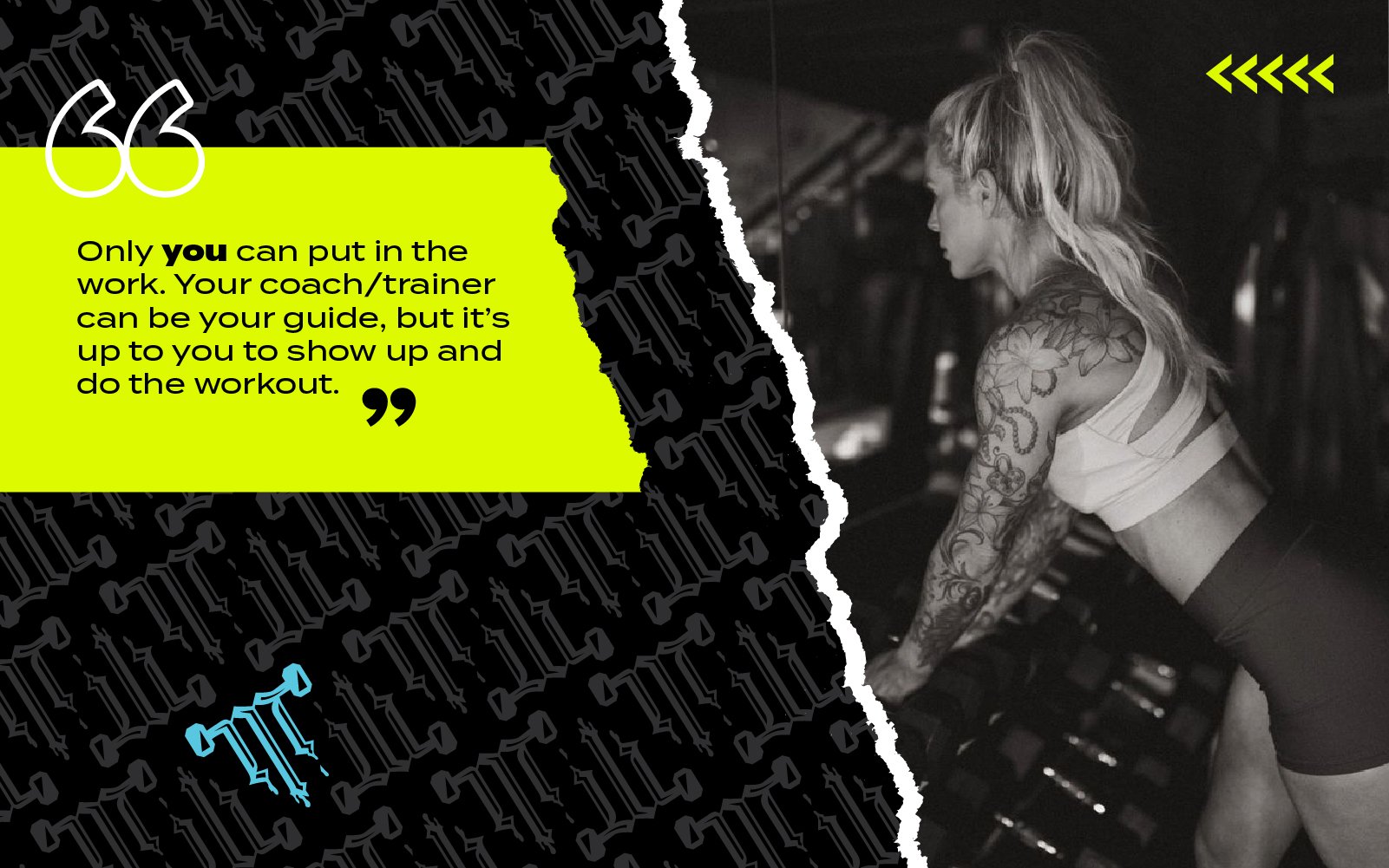
For the social graphics, the photography was supplied by another freelancer. I took those and the idea of ripped paper and layering to give that raw style she was seeking. Adding the “Train Like a Mother” concept helped elevate the intensity of the materials.
Conclusion
The edgy and electric vibe of the colors and graphics give Angie a youthful image that should draw interest to both men and women looking to take their workouts up a notch. While being a mom might have some write her off, this branding kit should have them take her more seriously.
Client: Tatted Mama Training
Team: Freelance
Role: Logo system, branding, and style guide development; creative direction and design of collateral
CASE STUDY
BRANDING • IDENTITY
STYLE GUIDE
Overview
This is a branding kit for Angie Mesenbrink, a local physical trainer in the Portland, Oregon area who is also a mom that could kick my a**.
I was approached by Angie (politely) to come up with something contemporary and bold that would appeal to a younger male and female demographic. The primary use of the brand would be for marketing on social media to grow her client base.
Timeline
2 weeks
Project Scope
The deliverables would include a flexible logo system, messaging (tagline), patterns, and photo graphics to convey the image she was looking for. The extra collateral was created for prototypes or ideas she could use down the road. Style guide developed for usage, as well.
Execution
For the logo, she wanted something flexible and bold, that could work in many iterations and sizes. While being in incredible shape as a mom is rare, another one of the unique traits of Angie is her tattooed body—adding the ink aspect into the T+M barbell monogram of the logo made a lot of sense, giving more emphasis to her name. The monogram also provides a simpler identifier, working well in instances where the full logo would be too small to read. The font used is Termina, which conveys a modern and heavy look.
The palette selected comes from a very popular combo of chartreuse and bright blue, to contrast the heavy use of blacks and grays. The chartreuse for spots of contrast or visual queues in layout.
For the social graphics, the photography was supplied by another freelancer. I took those and the idea of ripped paper and layering to give that raw style she was seeking. Adding the “Train Like a Mother” concept helped elevate the intensity of the materials.
Conclusion
The edgy and electric vibe of the colors and graphics give Angie a youthful image that should draw interest to both men and women looking to take their workouts up a notch. While being a mom might have some write her off, this branding kit should have them take her more seriously.
Client: Tatted Mama Training
Team: Freelance
Role: Logo system, branding, and style guide development; creative direction and design of collateral